Why every section is there.
We did not design this framework to look good in a screenshot. We built it around what a homeowner looks for before they pick up the phone. Take the tour, and see why each section exists.
We did not design this framework to look good in a screenshot. We built it around what a homeowner looks for before they pick up the phone. Take the tour, and see why each section exists.
A homeowner decides fast, and asks the same questions in the same order. Each section answers one of them. Here is every section: what it is, why it is there, and what you supply. Text in brackets marks where your details go, and the photos are samples.
Your business name and a Call Now button sit in a navigation bar with links to Services, Gallery, About, FAQ and Contact. Below it, a full-width photo carries an eyebrow line, your headline and two Call Now buttons. A round Call Now button stays pinned at the bottom right as visitors scroll.
Why it's there. A visitor decides in seconds whether they are in the right place. The hero says what you do and where, and Call Now is in reach before they scroll. Because the navigation bar and the round button stay on screen, your number is never more than a tap away.
You supply the name, phone number, photo, eyebrow and headline.
![The top of the framework: a navigation bar with [Business Name], a Call Now button and links to Services, Gallery, About, FAQ and Contact, over a full-width photo with [Client Eyebrow Text], [Client H1 Headline] and two Call Now buttons, and a round Call Now button at the bottom right.](assets/img/framework-01-hero.jpg)
The first screen of the framework, before personalization.
A thin band directly under the hero with four short items: licensed and insured, a warranty, years in business, whatever a homeowner in your trade checks before calling.
Why it's there. The first doubt is whether you are legitimate. Four short facts, right under the hero, answer it before the visitor has scrolled.
You write the four.
![The trust strip: four short items, shown here as [Badge 1], [Badge 2], [Warranty] and [Years in Business].](assets/img/framework-02-badges.jpg)
The trust strip, before personalization.
Under a What we do eyebrow and a headline, four service cards each show a photo, a name and a short description, followed by a Call Now button.
Why it's there. The next question is whether you do their job. A photo on each card lets a visitor find their service at a glance, and the Call Now button sits right below for the visitor who has found it.
You supply four services with one photo and one line each, and you can rewrite the headline.
![The services section: a What we do eyebrow, the headline Services Built to Last, four cards each with a photo, a [Service] name and a short description, and a Call Now button.](assets/img/framework-03-services.jpg)
The services section. The photos are samples; yours go in their place.
A gallery of eight photos under a Recent work eyebrow.
Why it's there. Proof beats adjectives. Eight photos of real work show a visitor exactly what they would be paying for.
You supply the eight photos.
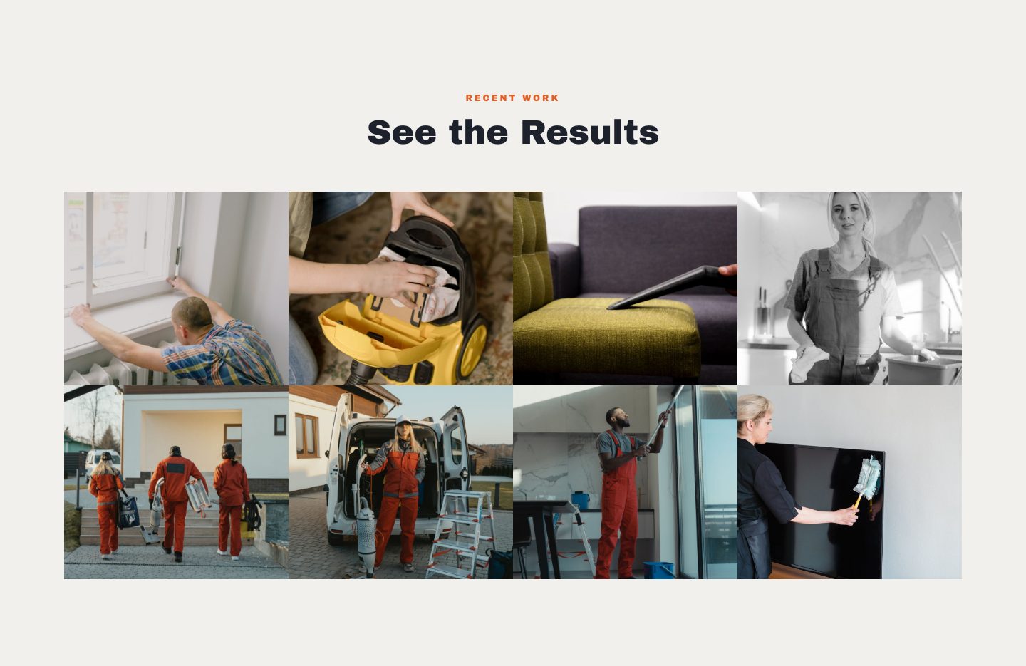
The recent work section, with sample photos.
A photo with an Est. year badge sits beside your story: an Our story eyebrow, a headline, two paragraphs, and a line for your certifications and licenses.
Why it's there. People hire people. A photo, a founding year and a short story turn a business name into someone a visitor can picture, and the certifications line answers the licensing question.
You supply the photo, the year, the headline, the paragraphs and the certifications line.
![The about section: a photo with an Est. [Year] badge, an Our story eyebrow, [About Headline], two paragraphs and a line for certifications and licenses.](assets/img/framework-05-about.jpg)
The about section, before personalization.
A dark band with eight cards in two rows, each a short title with one line on why it matters to the customer.
Why it's there. By now a visitor is comparing you with the next listing. Eight short reasons, each with why it matters to them, make the comparison for you.
You write the eight titles and their lines.
![The why choose us section: a dark band with the headline Built on Trust, Backed by Results and eight white cards in two rows of four, each a [Differentiator] title with one line on why it matters to the customer.](assets/img/framework-06-why.jpg)
The why choose us section: eight cards, two rows of four.
A band in your brand color with a headline, one line, and two buttons: Get In Touch, which scrolls to your contact details, and Call Now.
Why it's there. A visitor who has read this far is ready. The band gives them the next step in one line, with a button to take it.
You write the headline and the line.
![The call-to-action band: an orange band with [CTA Headline], [CTA Subline], a Get In Touch button and a Call Now button.](assets/img/framework-07-cta.jpg)
The call-to-action band.
A headline, a short description and six city names, followed by Not sure if we cover your area? Give us a call.
Why it's there. A homeowner outside the big city is checking one thing: do you come to my town? Six names answer it, and the invitation to call covers the edge cases.
You supply the headline, the description and the six cities.
![The service area section: an eyebrow, [Service Area Headline], a description, six city names and the line Not sure if we cover your area? Give us a call.](assets/img/framework-08-area.jpg)
The service area section.
Seven questions in an accordion, then Still have questions? with a Give Us a Call button.
Why it's there. These are the questions you answer on every call. Answering them once means fewer surprises and calls that start further along.
You write the seven questions and their answers.
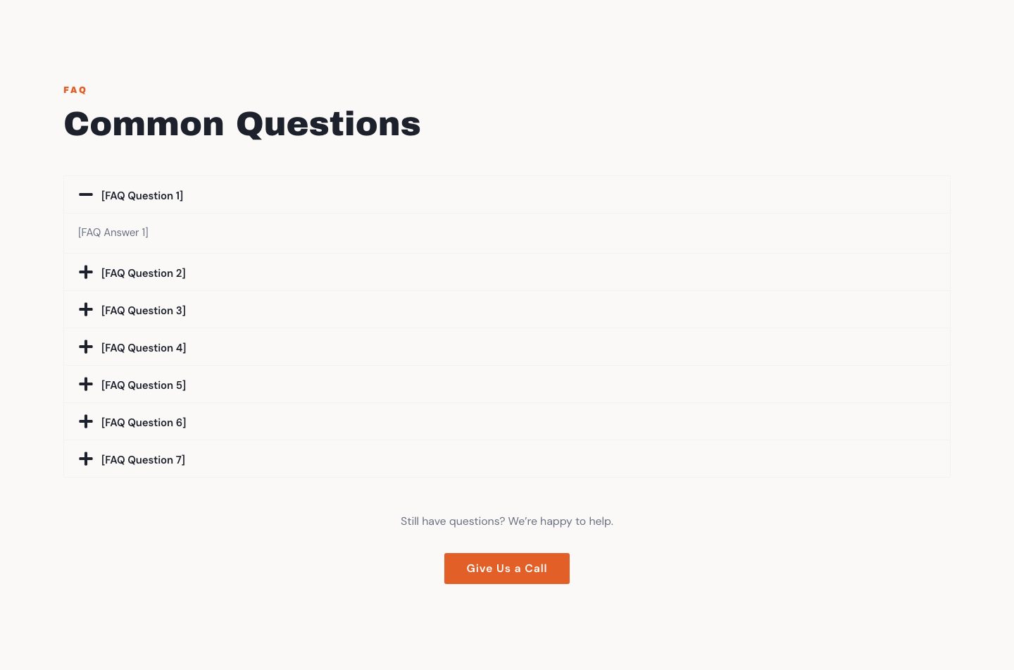
The FAQ section, before personalization.
The last section before the footer: a Get started eyebrow and a headline, then your phone number, your email and your business hours side by side, with a Call Now button.
Why it's there. Everything a visitor needs to reach you, together, in one place, so nobody has to hunt for it.
You supply the headline, phone, email and hours.
![The contact section: a Get started eyebrow, [Closing CTA Headline], then phone, email and hours side by side, and a Call Now button.](assets/img/framework-10-closing.jpg)
The contact section.
Your business name and tagline, quick links to the sections above, and your phone, email, city and state.
Why it's there. It is where people look once they have scrolled all the way down and still want to reach you.
You supply the name, tagline and contact details.
![The footer: [Business Name] and [Footer Tagline] on the left, quick links in the middle, and phone, email, city and state on the right.](assets/img/framework-11-footer.jpg)
The footer.
On a phone, everything stacks in one column. The hero headline stays large, buttons go full width, and the Call Now pill stays where a thumb can reach it. Nothing is left out; a customer on a phone sees the same sections as a customer at a desk.
![The first screen of the framework on a phone: [Business Name] and a menu button at the top, then the full-width photo with [Client H1 Headline], a full-width Call Now button and a round Call Now button.](assets/img/framework-mobile.jpg)
The first screen on a phone.
Everything a customer reads or looks at is yours. The structure underneath it is the same on every Horizon site.
A fixed structure is not a compromise. It is the reason the site looks right, launches fast and stays affordable.
Every site on the framework looks finished, because the structure cannot be knocked out of shape by a stray edit. No accidental DIY damage.
We personalize a proven structure instead of designing one from nothing, so your site is live within 72 hours of finishing the online form.
Reusing one proven framework is how a real website costs $59 to set up and $99 a month on a 12-month plan, instead of thousands up front.
Every section sits where a service-business visitor expects it: services, trust cues, service area, and an obvious way to get in touch.
Every Horizon website uses this framework. Your name, colors, photos and text go in; the structure stays. Scroll it, and pick a trade to switch.

Desktop. Scroll inside the frame.

Phone. Scroll inside the frame.
The framework exactly as it ships, with sample text and sample photos. Scroll either frame.
The framework is up as a working website you can click through. It shows placeholder text in brackets where your details go, and some empty image slots where your photos go.
The preview sits right next to checkout. No card needed to look.
Opens in a new tab.
$59 one-time setup, then $99/mo. for 12 mo. or $169/mo. with no commitment. No sales calls.